Check out the completed film above!
Why'd We Make This?
Ashli's Thesis Statement
Collaborative teamwork is a key component in the animation process, and allows for much greater possibilities and accomplishments than what would be achieved alone. Working together to minimize weaknesses and enhance strengths is often the best solution to a difficult task. Opting to work with a partner for 60 MPH, and making the process as efficient as possible with the use of symbols, simplified characters, and clear communication allows for the best use of our limited time.
Proposal
To create a humorous 2D short film collaboratively that allows us to emphasize our strengths in working in symbol animation. With simple character designs that lend themselves well to symbol animation, and effective communication from the start, we are able to effectively create a film to showcase our shared talents.
Alec's Thesis Statement
More and more animation is shifting towards web based media, and most of it is gag based, slice of life, with little continuous storylines. Story is one of the most important aspects of an animated cartoon series that will captivate the audiences.
Proposal
To create a humorous 2D short film series that is able to be viewed in multiple online media sites, such as Twitter, Facebook, Linkedin.
With simple character designs that lend themselves well to symbol animation, and effective communication from the start, we are able to effectively create a film to showcase our shared talents.
How'd We Make This?
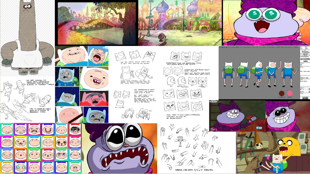
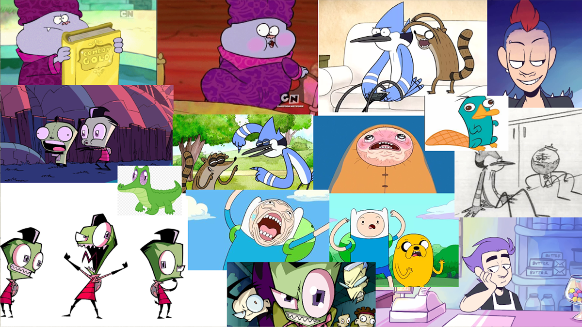
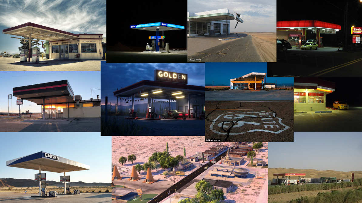
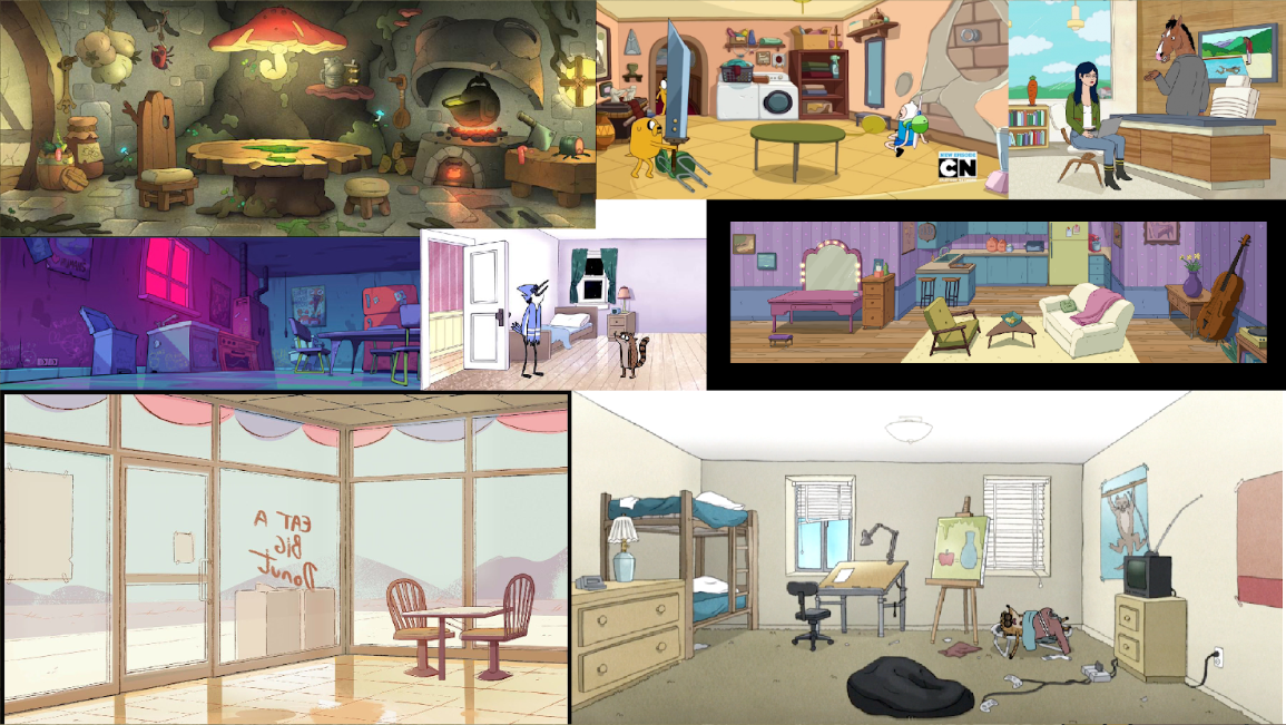
Character & Environment Inspirations
First off, we had to figure out what we wanted this film to look like? What did we want to pull inspiration from? We liked the flexibility of cartoons such as Adventure Time, Chowder, Regular Show, and Invader Zim. This is the direction we started in. With a direction we wanted to go in, we then had to figure out: Where is this going to take place? Form the beginning, we knew this would be in a convenience store, but where? Two teens bored out of their mind in an almost always empty store? A convenience store set in the middle of the desert with no other places for miles was the ideal fit. With a style, and inspiration and mind, we got to work on making our own characters and ironing out story.
Story
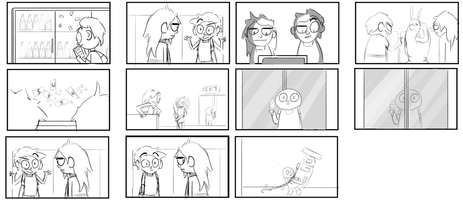
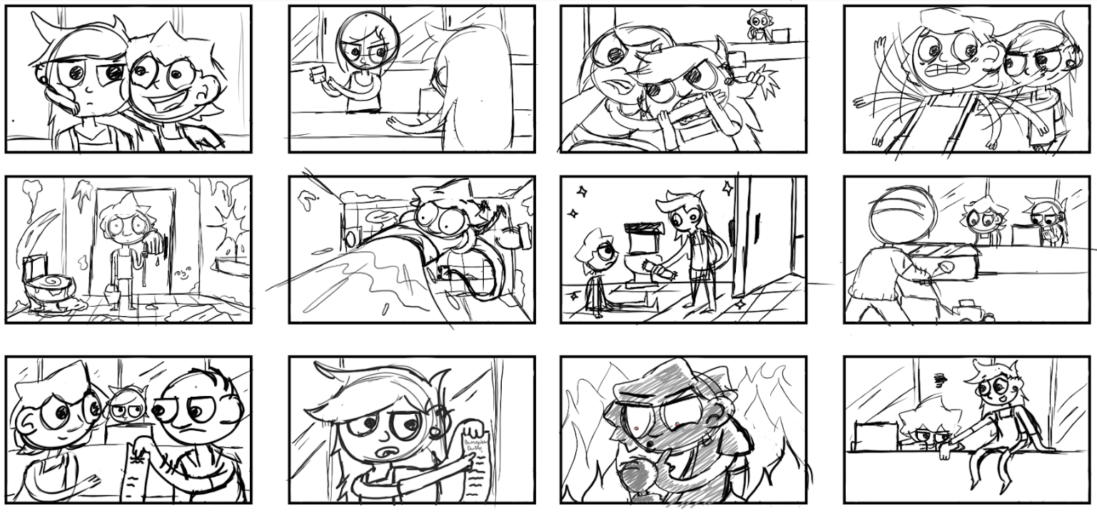
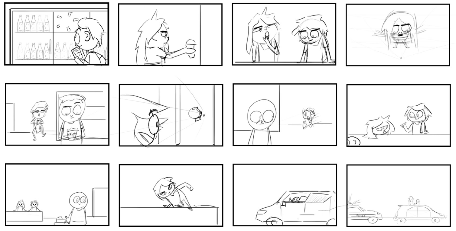
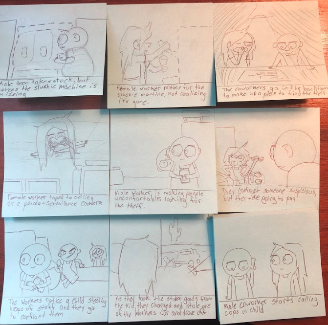
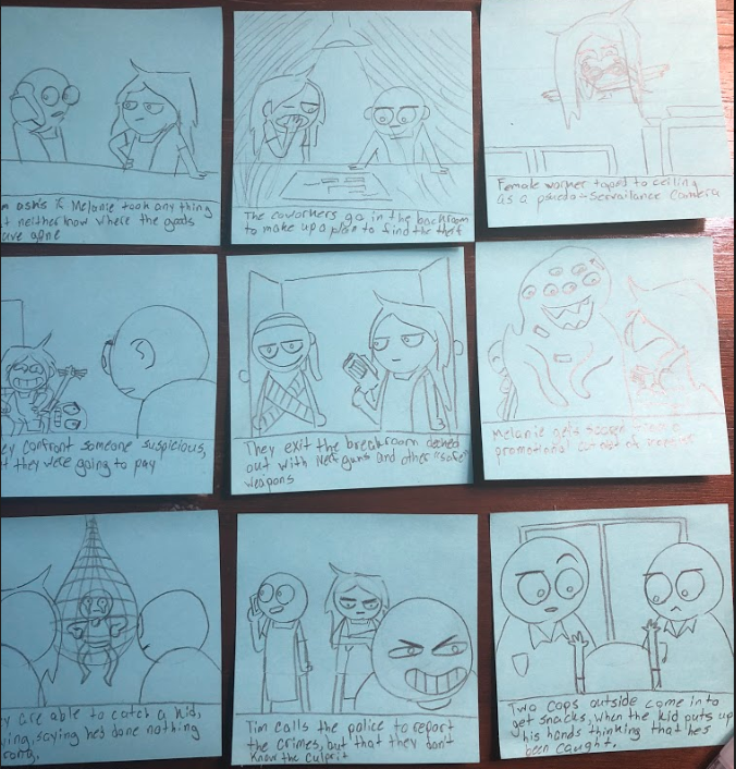
Early ideation and thumbnailing.
Story was by far the most difficult part of the thesis process. From the beginning, Alec & I knew if we took the short film route for our thesis, it had to have humor in it. Our film pitch initially started as two people defending their store from not one, but multiple extremely elusive thieves. As story continued to develop and went through various iterations and variations of our story, we ended up with the current idea of our film: Melanie and Tim defending their store (and jobs) from a kid stealing all of their products.
Nailing our gags was another difficult part of the process, nailing down time and humor we found appropriate was tough,. Often, many of the gags that you see in the final film are suggestions Alec and I jokingly made while in mid production of the film.
Comparison of our animatic to the final looks of the film.
Characters
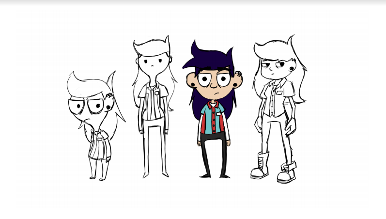
Early concepts and style experiments.
Melanie
Melanie is the bitter, somewhat apathetic manager of 60 MPH Convenience. She spends most of her time on her phone, and ignoring the occasional customer that actually does show up to their store. Occasionally, she does stock items but for me most part she leaves it to Tim just because she can. Overall, she does not care much for her job, however she does need some kind of income, and working at a convenience store in what’s essentially the middle of nowhere is the easiest way to do it.
With Melanie, we wanted to keep a simple overall design that presents itself as somewhat complex to contrast Tim. Melanie is mostly made up of circles, ovals and rectangles. Most of her rounded elements are cut with sharp lines and angles, making you have a second thought about how “friendly” her rounded shapes make her look at first glance. In her rig, her legs and feet are made into a single symbol since she's never shown walking with her full body, only above the waist.
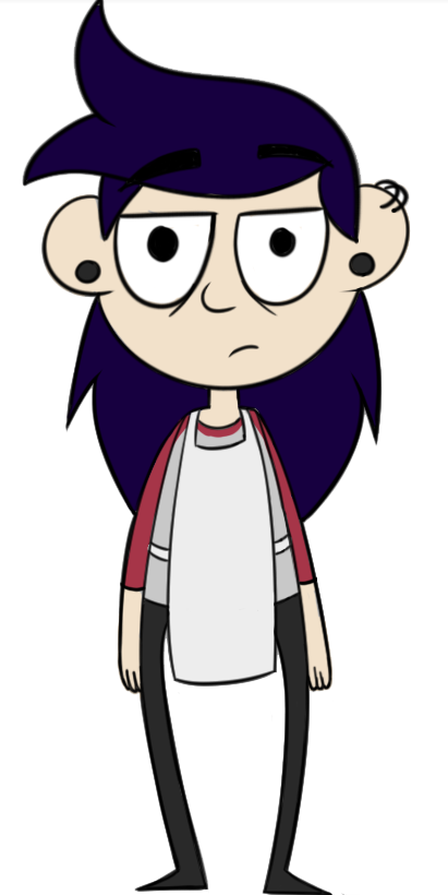
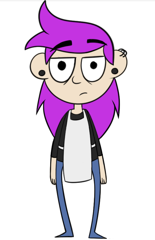
Early Melanie color concepts and styles, before we decided to make both Melanie and Tim based on Alec and myself.
Tim
Tim is the happy-go-lucky and eccentric half of 60 MPH Convenience. When he isn’t stuck with tasks that
Melanie should be doing, he spends a lot of his time figuring out some way to (unintentionally) cause
trouble in the store. He may not be the smartest, or the best at planning things out well, but he’s just here
for a good time. Like Melanie, he doesn’t exactly “like” his job, but as long as he can figure some way to
have fun with it, he’ll gladly show up to work everyday. He does the vast majority of stocking, cleaning, and
organizing in the store. Tim’s a little weird, but he’s definitely the best right hand man you could ask for.
Tim’s design is simple, and he is intended to look a bit more simple than Melanie since he could be considered a bit “simple-minded.” Tim’s a lot more rectangular in his design, showing he’s actually a bit more grounded and determined than Melanie is. His rectangles are complimented with rounded edges to highlight that he is just about as friendly as he looks. Since he doesn’t have the benefit of “rebellious teen dyed hair" to stand out more like Melanie, his hair and clothing are quite saturated to contrast our desaturated grounds. Like Melanie, his legs are made into two separate symbols with a few different poses, as his full body is not seen while walking.
Ghost Kid
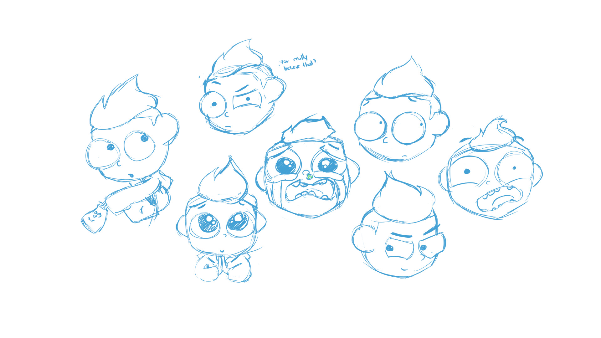
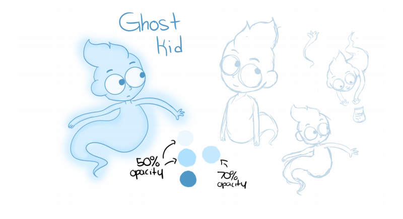
Not much is known about Ghost Kid. His mum left him at 60 MPH Convenience over 100 years ago and he
died there. He’s a bit of an a**hole (understandably when you’ve been haunting a crappy store in the middle
of nowhere for a century), and enjoys messing with people. He’s also very good at manipulating dumb
people, also known as Melanie and Tim.
died there. He’s a bit of an a**hole (understandably when you’ve been haunting a crappy store in the middle
of nowhere for a century), and enjoys messing with people. He’s also very good at manipulating dumb
people, also known as Melanie and Tim.
Ghost Kid is essentially a head, torso, and tail. He’s the second simplest character out of everyone. His tail is modified brush line that is set to loop without us having to interfere. Him being blue helps him stand out from our more “natural” palette of the store. Since he doesn’t actually have legs and floats everywhere, he’s very easy to animate when he moves. His design has a lot of round elements to fool you into thinking he’s just a sweet unfortunate kid, but that “fiery” hair and smug expressions of his would tell you otherwise.
Early in the story process, the Ghost Kid was alive and well, however, to open up more gag opportunities, he was killed off and ended up as the Ghost Kid you see in the final film. This is how he looked before that change.
Jasmine
Jasmine is Tim’s pet alligator who acts as a watchdog for 60 MPH Convenience. She previously lived in the men’s toilet until Tim rescued her. She isn’t very good at her job, as she is easily scared or confused by pretty much anything, but she still tries her best. She had the bow on before Tim before Tim found her.
Jasmine is by far our simplest character, she does not walk at any point so her legs have only two poses, for when she is standing still and when she is being held. Her torso and tail are once piece as her tail does not move at any point, this also has a pose for when she stands on her own and when she is being held. The most complex part of Jasmines design & rig was having two sets of her jaws that allowed her to show her teeth whenever she opens her mouth. Design wise, we wanted a simple looking, friendly alligator. Her only sharp edges are her “claws”, tail, and teeth, aside from that, she’s pretty round and friendly.
Her primary inspiration was taken from Gummy, the pet alligator featured in the TV series My Little Pony. She also has some influence from other "Wall-eyed" characters such as Perry the Platypus from Phineas and Ferb, and Foxes from the game Minecraft.
Backgrounds
Early 3D mockups to aid in the visualization of the final store.
Concepting
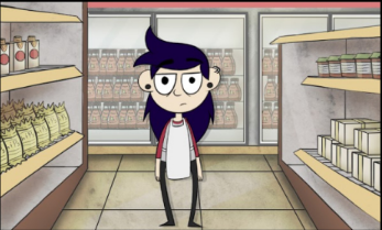
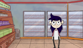
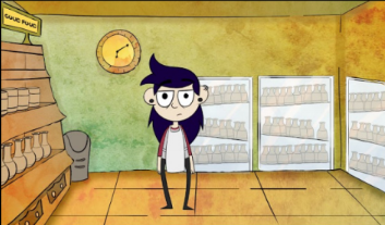
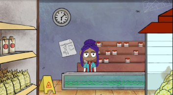
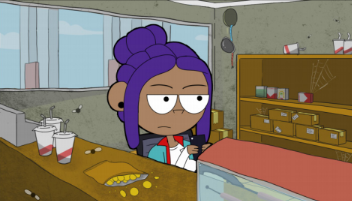
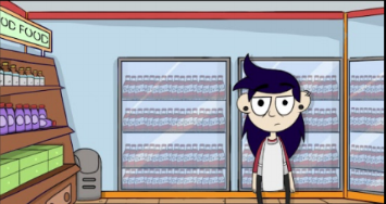
Final Grounds
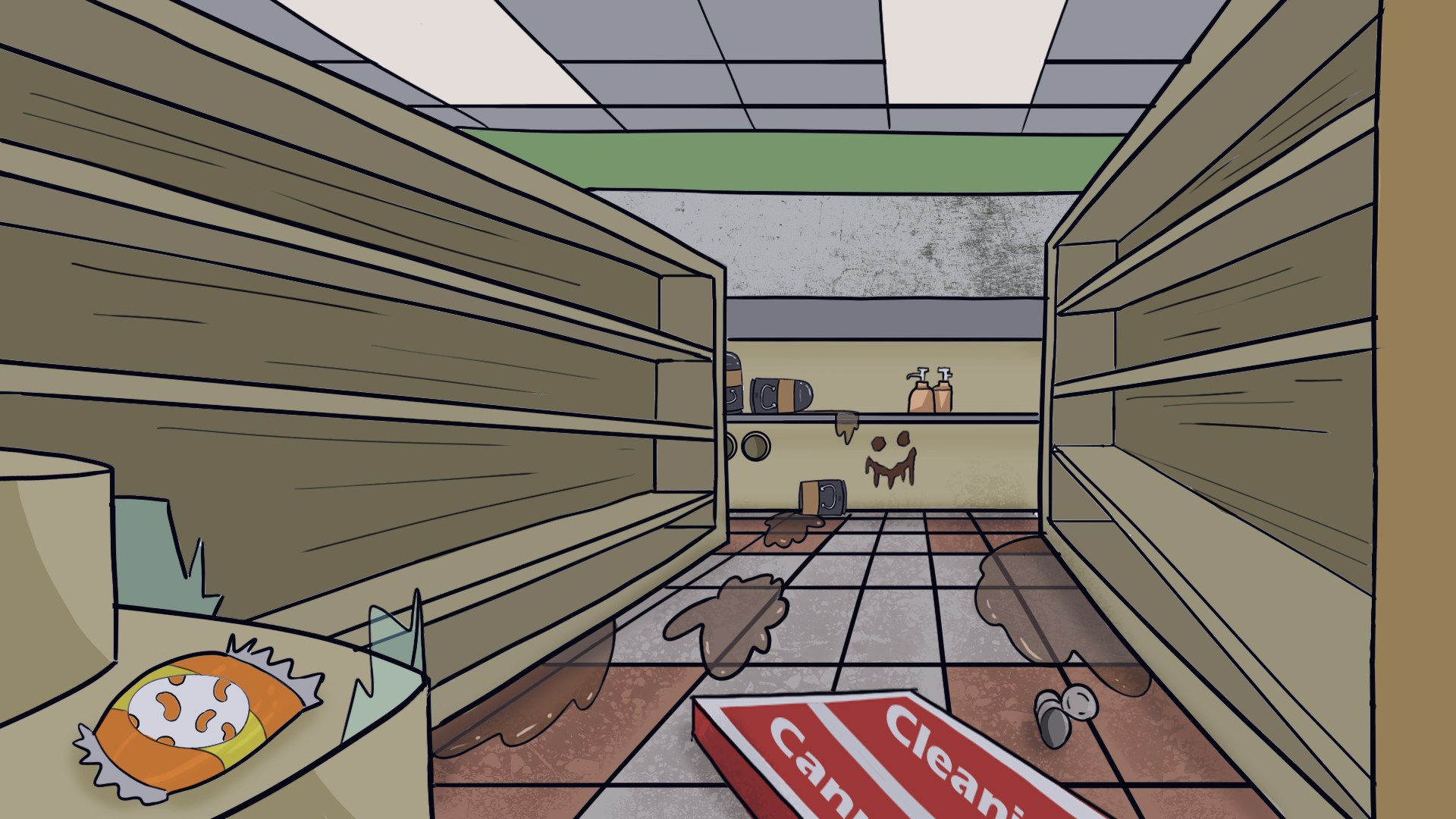
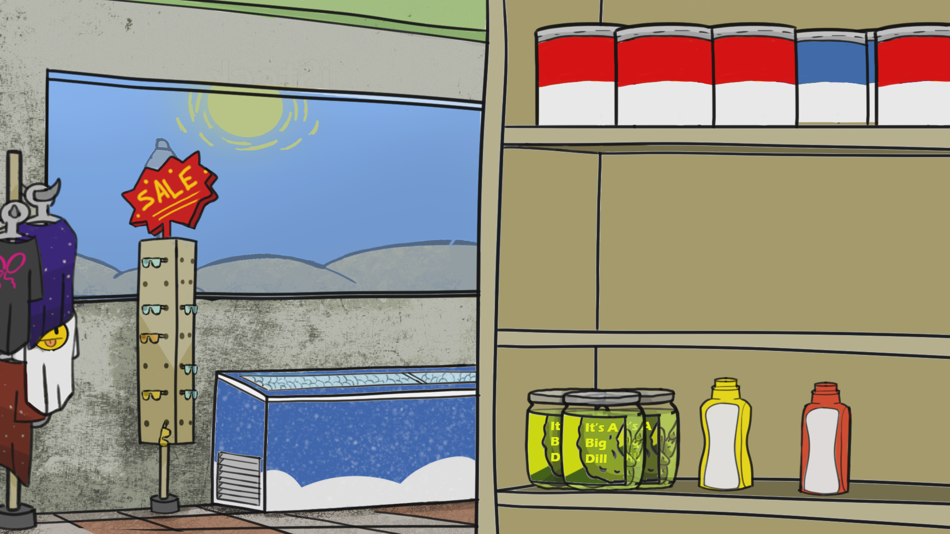
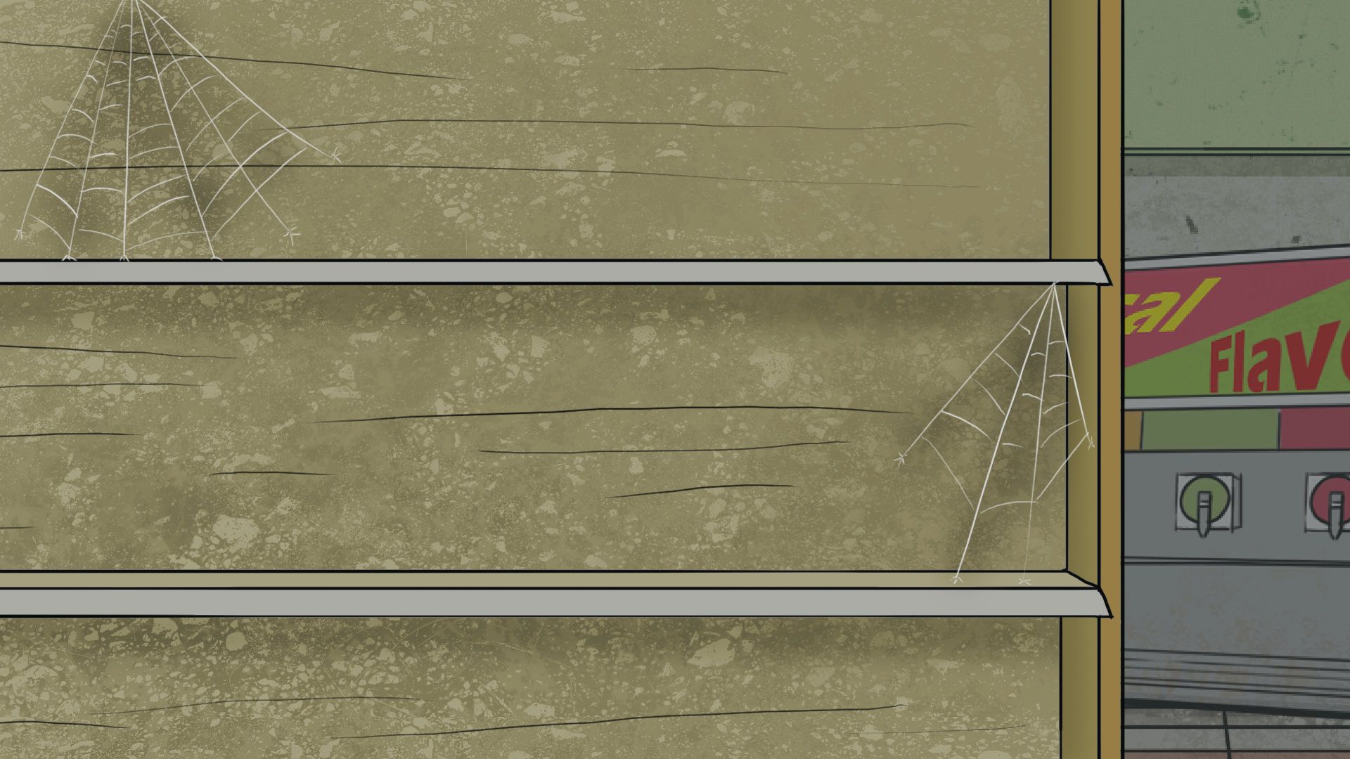
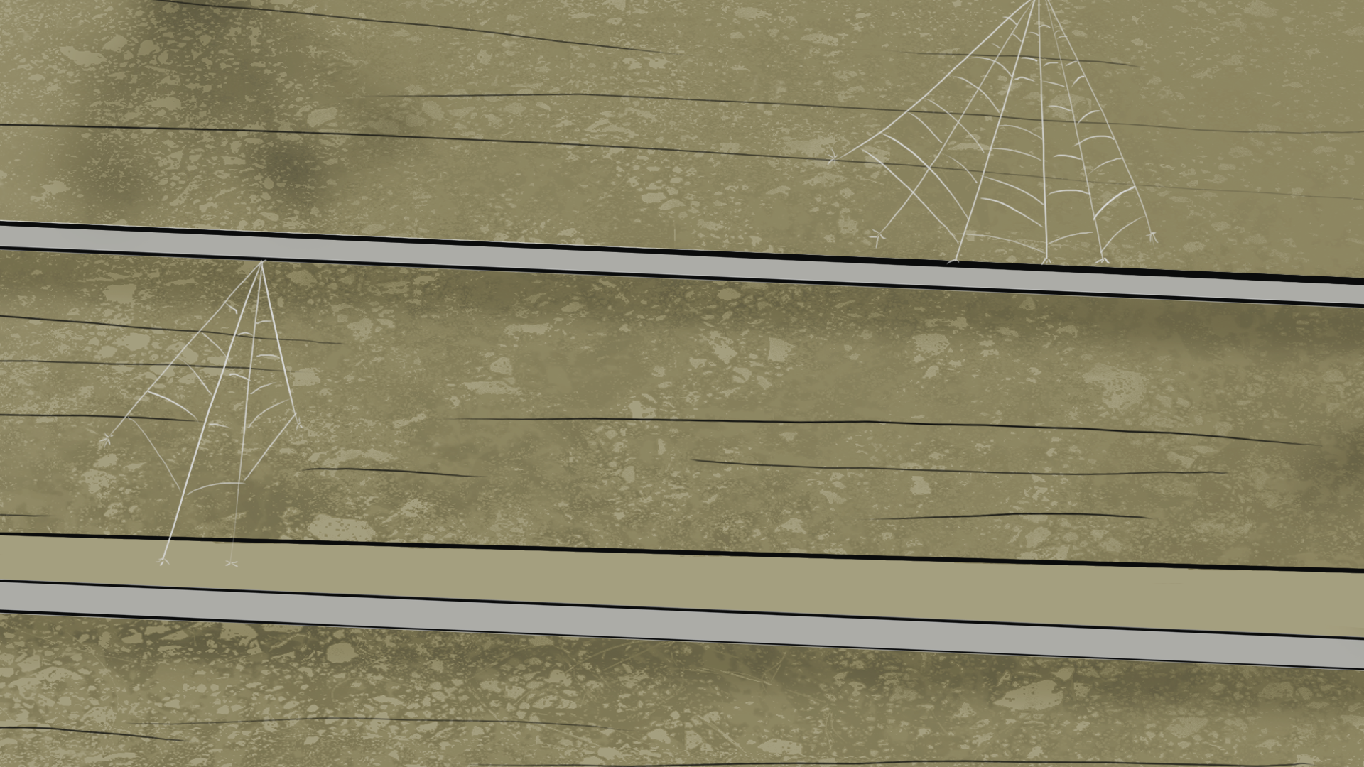
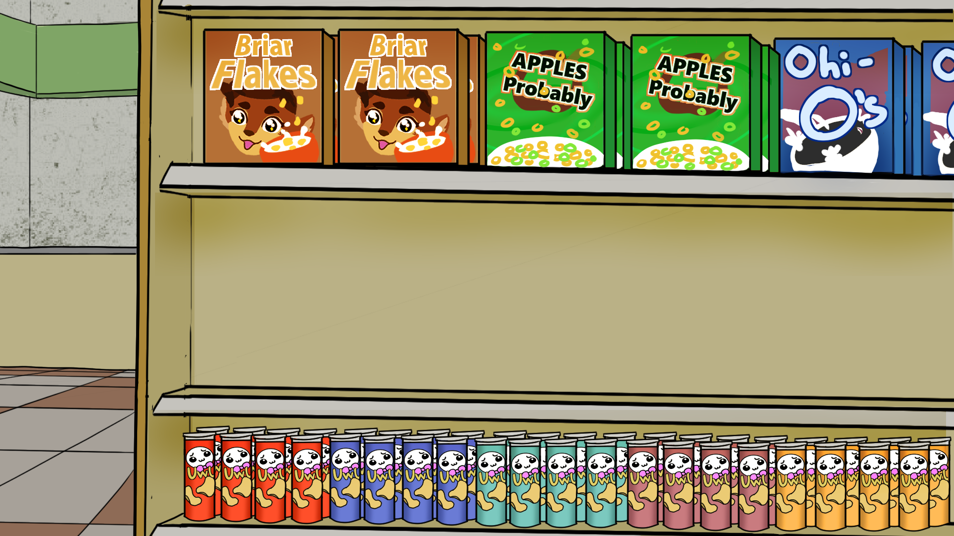
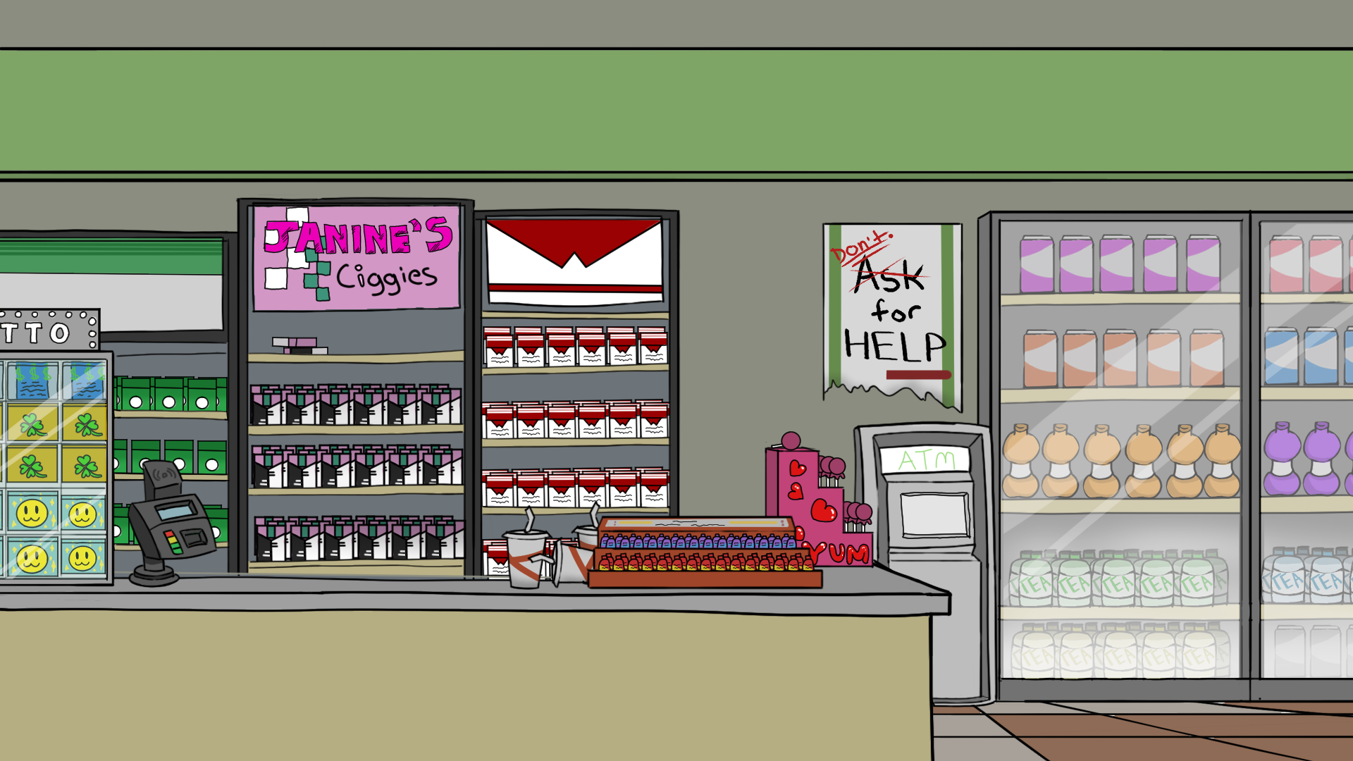
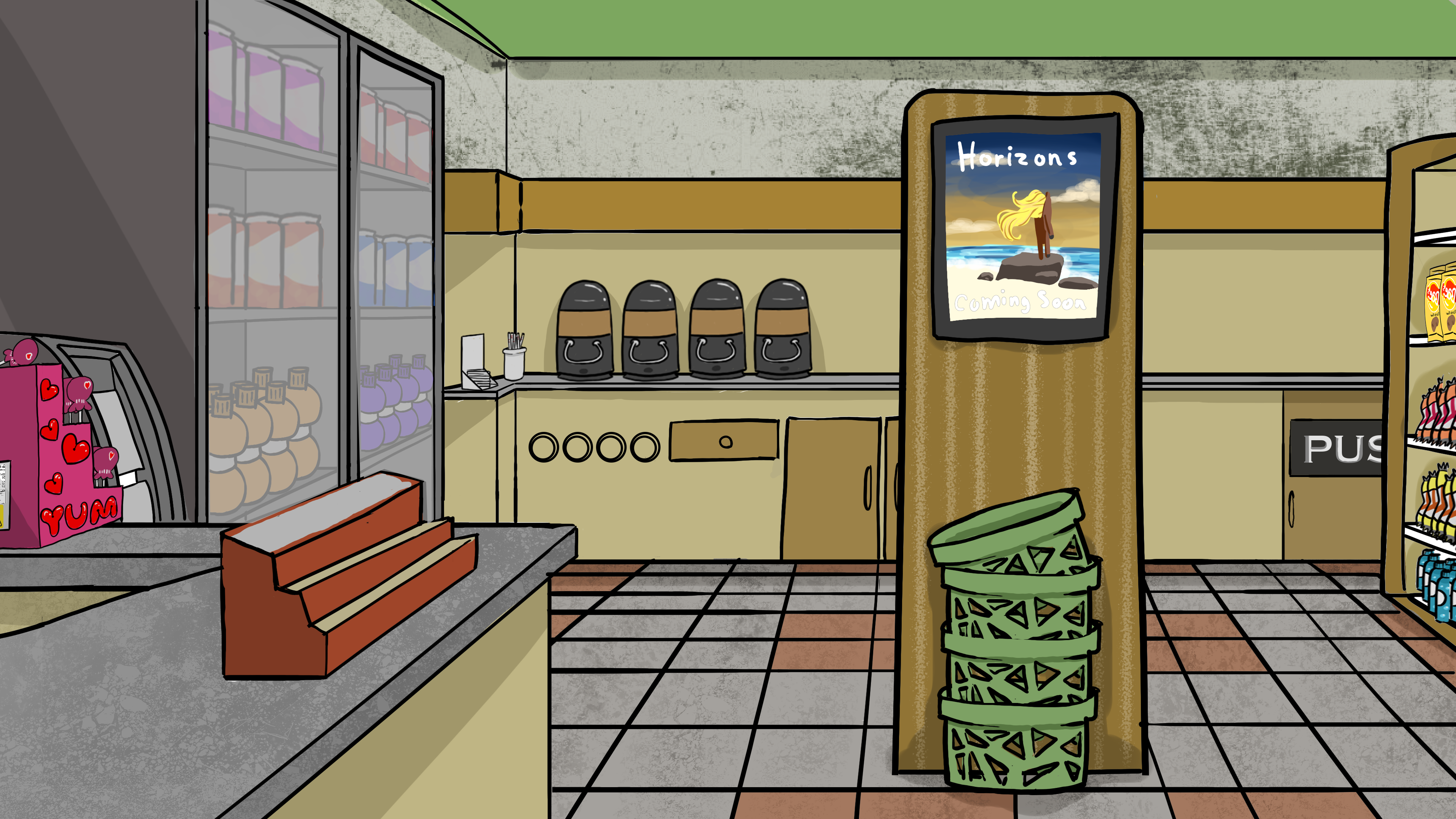
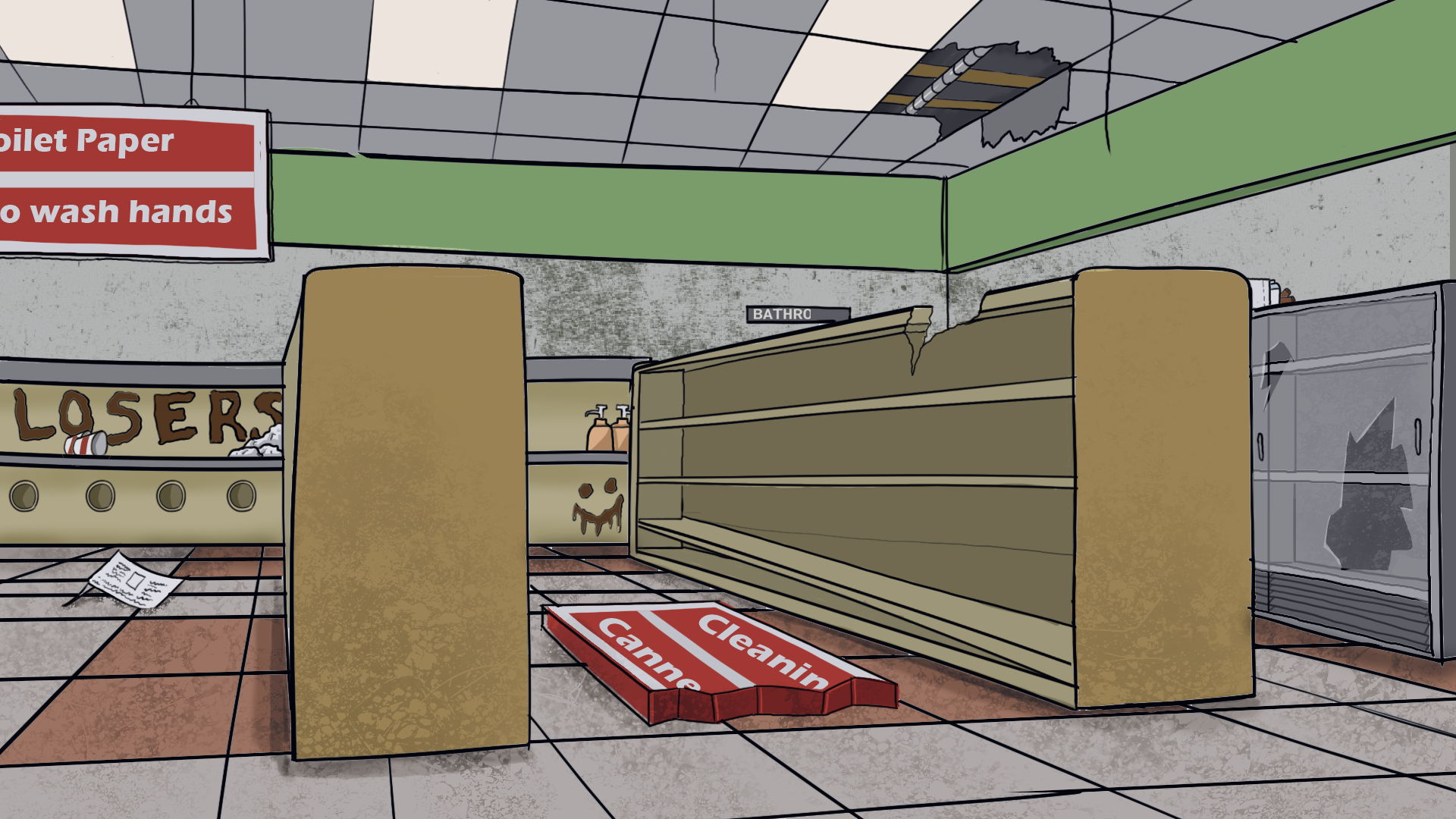
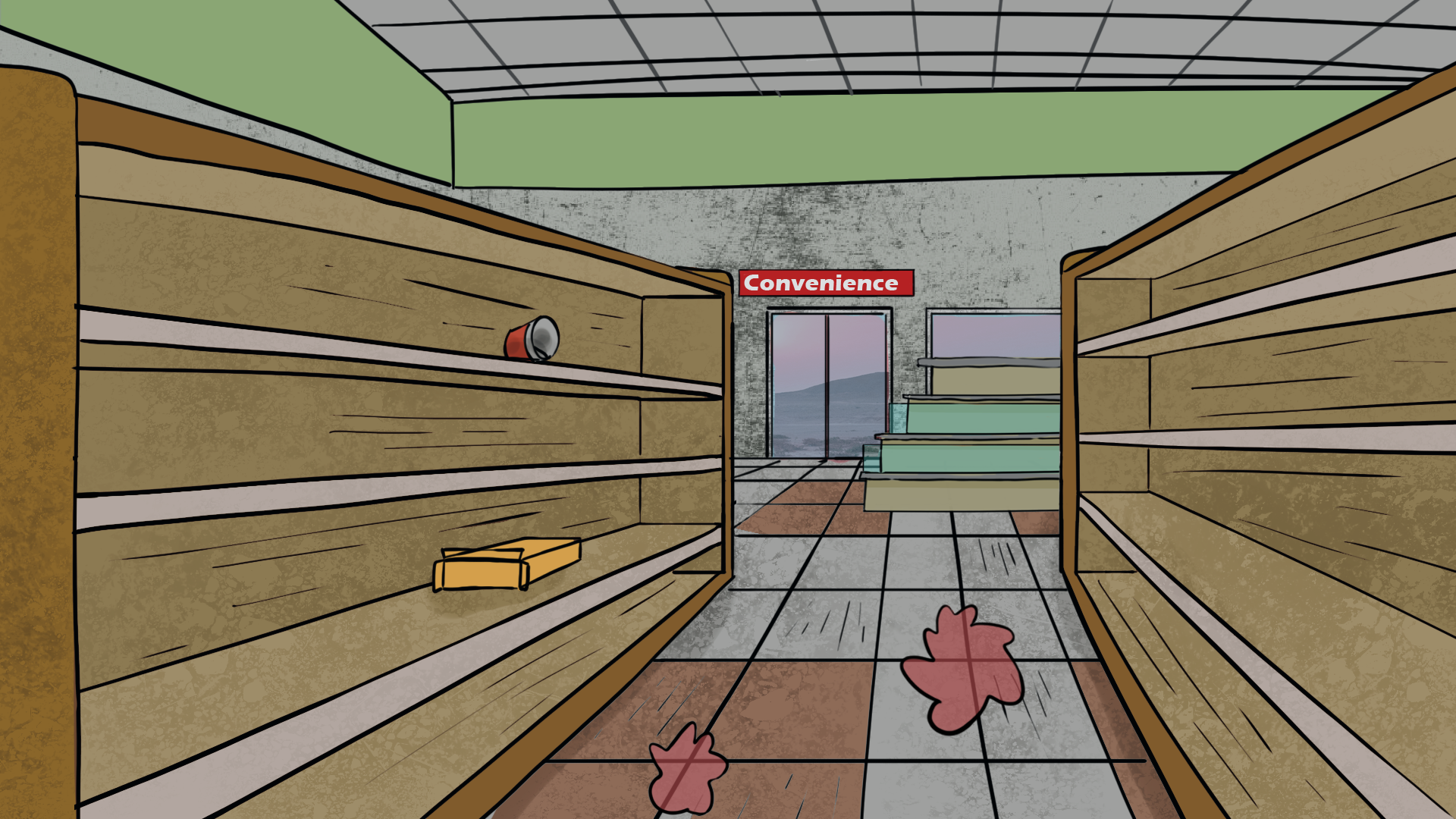
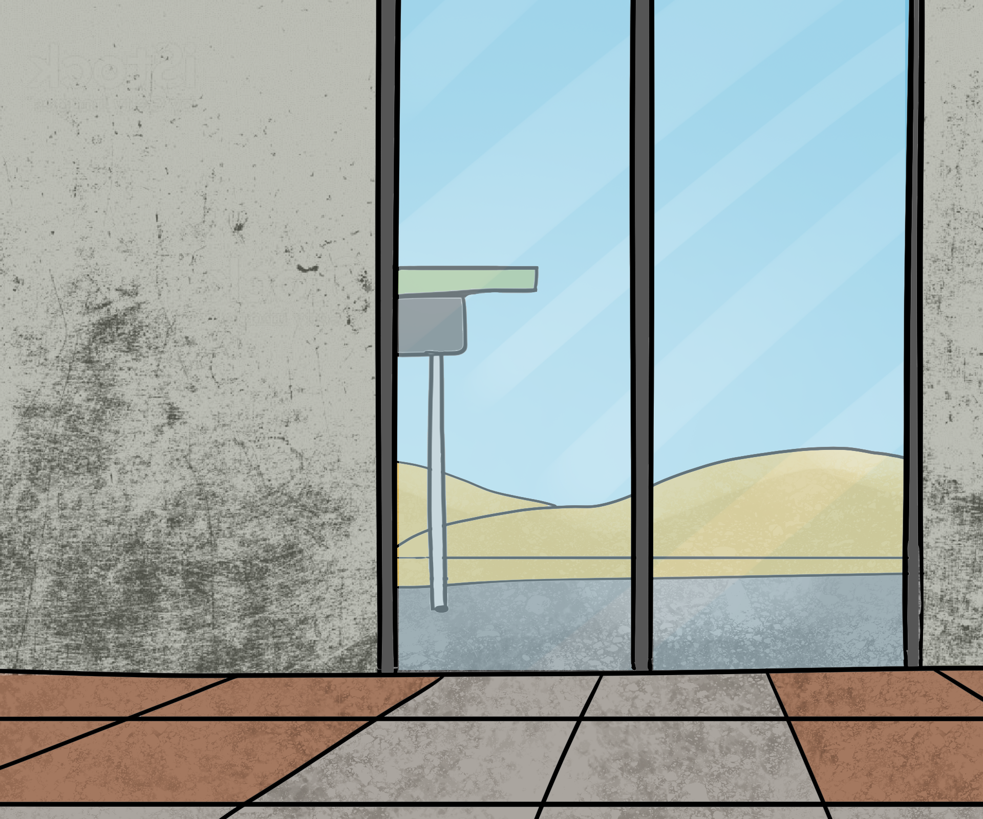
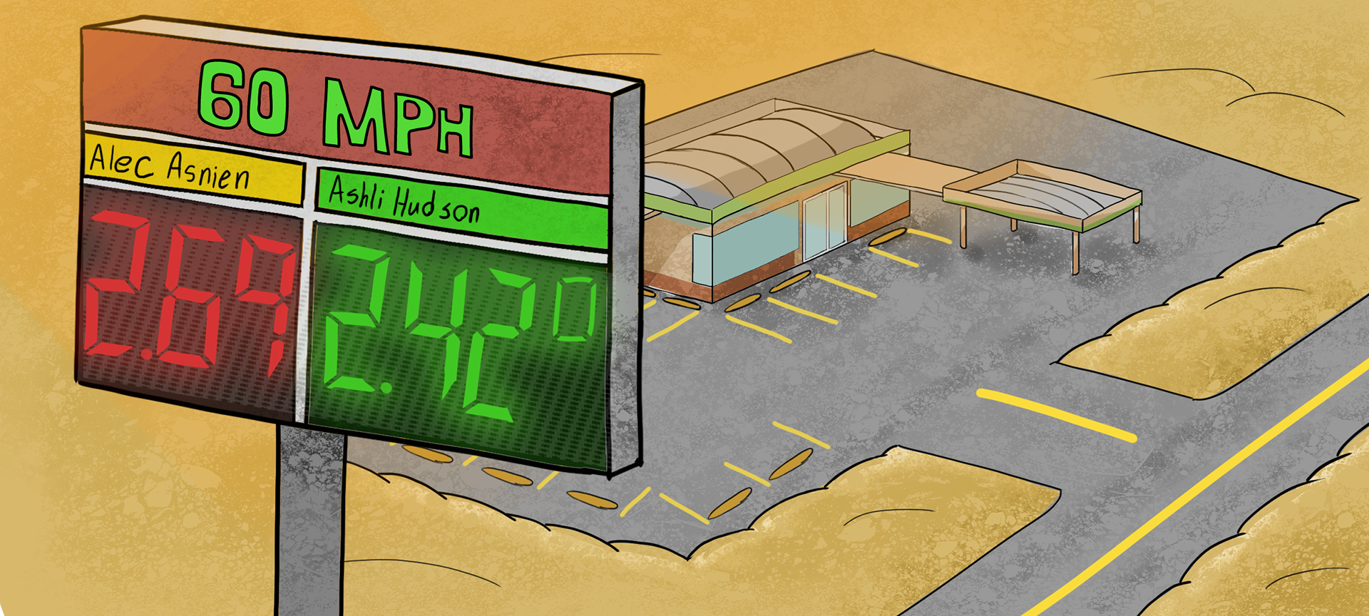
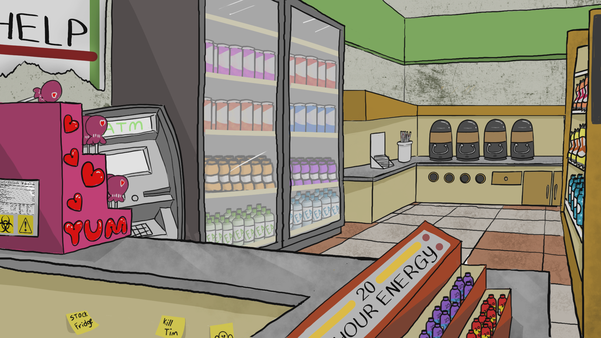
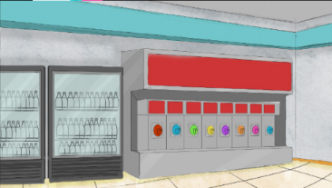
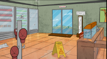
With our backgrounds, we wanted to get a feel of “That one really shady and kinda gross convenience store near you that you don’t really want to go to if you had another choice.” This meant that our store had to be kinda crowded in terms of overall space, and needed a lot of use of texture to achieve the effects of dirt throughout the store.
This use of texture was also influenced by shows that use a similar style of background
like Regular Show and Chowder. Since 60 MPH Convenience doesn’t attract many customers, it is almost always fully stocked with expired products, and there’s quite a few signs of vandalism thanks to
Melanie in the form of crude sticky notes and a defaced “Ask for help!” sign.
like Regular Show and Chowder. Since 60 MPH Convenience doesn’t attract many customers, it is almost always fully stocked with expired products, and there’s quite a few signs of vandalism thanks to
Melanie in the form of crude sticky notes and a defaced “Ask for help!” sign.
The store is in the middle of nowhere, so its exterior, although rarely seen is entirely
desert, with the exception of the road leading to and from the store, and the store
itself, and occasional cacti.
desert, with the exception of the road leading to and from the store, and the store
itself, and occasional cacti.
Props
Many of our props were either drawn in Adobe Photoshop and implemented as background elements, or directly in Adobe Animate so they could easily be converted into symbols that worked seamlessly with our characters.
Animation
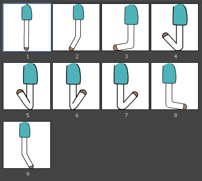
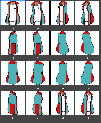
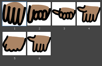
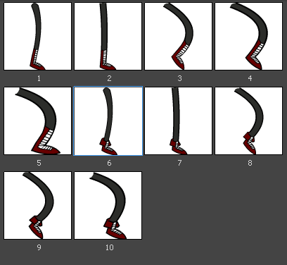
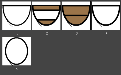
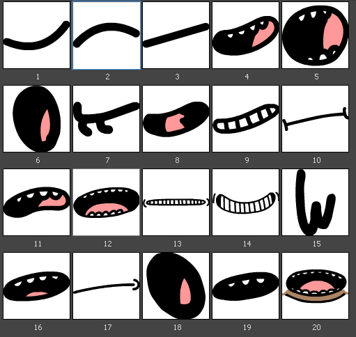

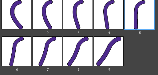
Melanie's animation rig & various frame poses.

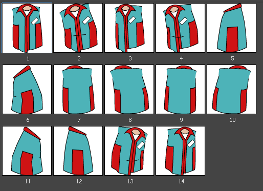
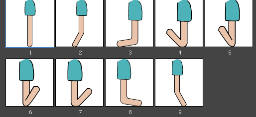
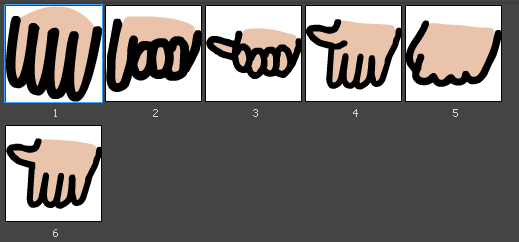

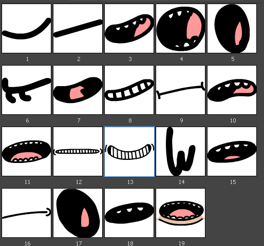
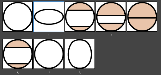
Tim's animation rig, note the majority of shared assets with Melanie.
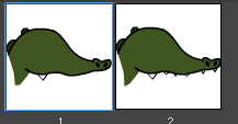
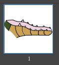
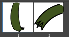
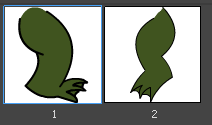
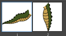
Jasmine's animation rig, extremely simple due to her lack of screen time and overall movement.
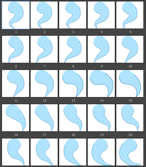
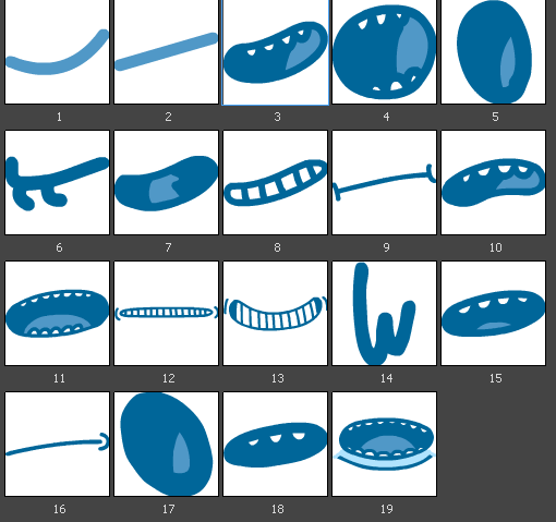
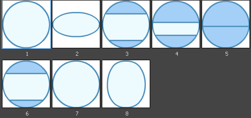
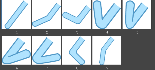
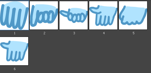
The Ghost Kid's animation rig. He shares most of Tim's assets, and his most complicated feature is his shape tweened tail.
For much of this process, animation was being worked on at the same time as backgrounds, props, and final comp. Alec and I animated strictly in Adobe animate to make the most of using symbols as our preferred method of animation, this includes building 2D rigs of each of our characters. Many assets could be reused between characters, and all characters with their fairly simple designs were easy to rig and ultimately animate.
Thanks for checking out this page!
Remember: 60 MPH can be viewed by clicking the "Back to Top" button to take you back up to the top of this page.
